A Quarter Blue

a website redesign

Project Overview

A Quarter Blue is a nonprofit that specializes in therapy and support for victims of trauma. In their journey to help their community, their website was often an afterthought and this results in a very ineffective user experience.

By collaboration with A Quarter Blue, we were able to lead their vision of recreating a space for trauma therapy online and tell their story online.
The Challenge
The current design for A Quarter Blue’s website is confusing, unintuitive, and visually inconsistent for target users looking for information and support.

yThe Solution

Our redesign focuses on clarity, consistency, and structure to help users better navigate through the website and obtain the necessary resources.Static and dynamic content editing

To begin, we decided to understand how A Quarter Blue is built out as a website, its design and information architecture. This is the way we can determine to see how AQB provides information to their targeted users. As a result, we conducted an entire heuristic evaluation of the website and came up with the following analysis

Heuristic Evaluation

From our evaluation, we came up with the following analysis of the website:
      The website design is very outdated and require a more modern redesign, including a consistent style guide, to improve user's experience.
       The unorganized navigation, broken links, and redundant information makes it extremely hard for users to access information on the website.

Proto Persona

Before starting on our redesign, we created a Proto Persona. Jenny, 20 years old, is a college student. Her best friend is in an emotionally abusive relationship and Jenny wants to be more than a support system, she wants to find information to help her friend get out of the toxic situation she is in, but does not know where to find that information. Her goals and pain points are factors to help us start our research process.

Usability Test

From our research, we started to develop our problem statement, and decided to conduct 3 usability tests to find out the current painpoints that users are having with going through the AQB website. We wanted to see if there were any similarities that we have found in our heuristic evaluation, and also find out if there are more pain points that we have yet to discover

From our research, we have received very detailed insights on user's pain points. There is a significant amount of issues within the website that we want to address in our redesign:

  • Users found it hard to maneuver throughout the website to look for resources or sign up to a session
  • Users did not like how the donation process took them to another tab
  • Users did not like that workshop sessions were not listed on the website, however, it was written in a pdf that users had to download on their desktop
  • Users were distracted by the outdated imagery and photos being used, they did not like the experience of navigating through the website
  • Information was text heavy and there was a clear lack of informational hierarchy throughout the website.

User Interviews

Our next step was to start our user interview process. We decided to only conduct in-person interviews for in-depth insights into our users. Another reason why is the nature of A Quarter Blue itself. This is a website of a nonprofit that specializes in helping survivors and victims of volatile relationship situations. It would be difficult to create an unbiased and non-triggering survey to be sent out to a mass sample. To maintain a level of sensitivity and relevance, we decided in-person interviews would be best.

As we conducted our interviews, we found these following findings:

  • Users were deeply discouraged to explore the website due to the confusing information architecture, especially when attempting to register for a session.
  • Users wanted to see more impact the nonprofit had on their clients due to their sensitive type of work. They would like to see testimonials.
  • Users did not like the stark colors and designs of the website, and found it to be depressive and uninspiring. Emotions that are not good to incite from users who are visiting the website to seek help.
  • Users had no idea what the organization does. There is very limited information on what A Quarter Blue provides in terms of services.

Definition & Ideation

In our process to organize our thoughts, we created an affinity diagram to brainstorm how to recreate  A Quarter Blue into a functional website. After bouncing our ideas around, the team came up with the following features in our prioritization matrix that we believe to address user's pain points:
  • Simplify footer
  • Rearrange primary navigation bar
  • Take away the distracting fraud alert banner and redesign it in a subtle way
  • Take away distracting graphics
  • Reorder page hierarchy for homepage, resources, events, and donate page.

Information Architecture

Reorganization of the website begins

After our brainstorming, we decided the next step is to do card sorting of the current IA of the website and recreate a new site map that will reorganize and shorten the overload of information on the primary navigation bar. Users will be able to navigate the website more efficiently and soundly.

Site Map

Our primary navigation bar was shorten to 5 tabs

We decided that we would have the primary navigation will have the following system for maximum impact:

  • Home button
  • About Us: where user can find out more information about the nonprofit
  • Events: where user can easily find upcoming events or therapy sessions easily
  • Resources: where user can find free resources such as ebooks and testimonials
  • Connect: where user can fill out interest forms if they want to get into contact
  • Donate & Shop: they will be designed through a simple icon and a call-to-action button to distinguish from the rest of the primary navigation

User Flow

Following our IA, our next step is to develop an effective user flow for our user persona.

Initially, our user flow started off with exploring the About Us page, as users are naturally curious about what the organization can provide. However, we thought that would force the user to backtrack a lot in their exploration of the website, so we decided to add more information of AQB into the homepage and allowed the user to have 3 simple task flows to complete:

  • Explore the resources page for downloadable ebooks and resources with reviews
  • Explore the events page to sign up directly to any therapy session
  • Donate quickly through our Donate button

UI Style Guide

Prototype & Testing

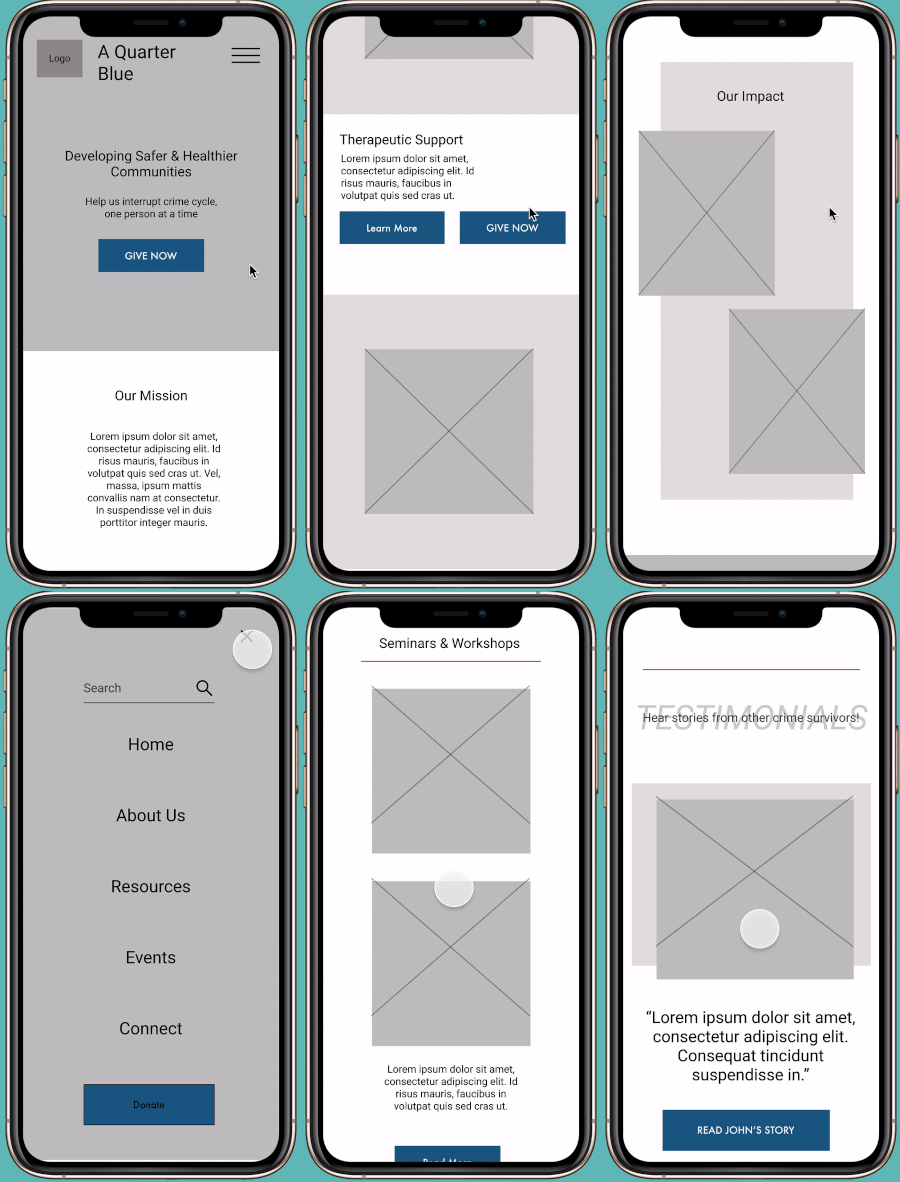
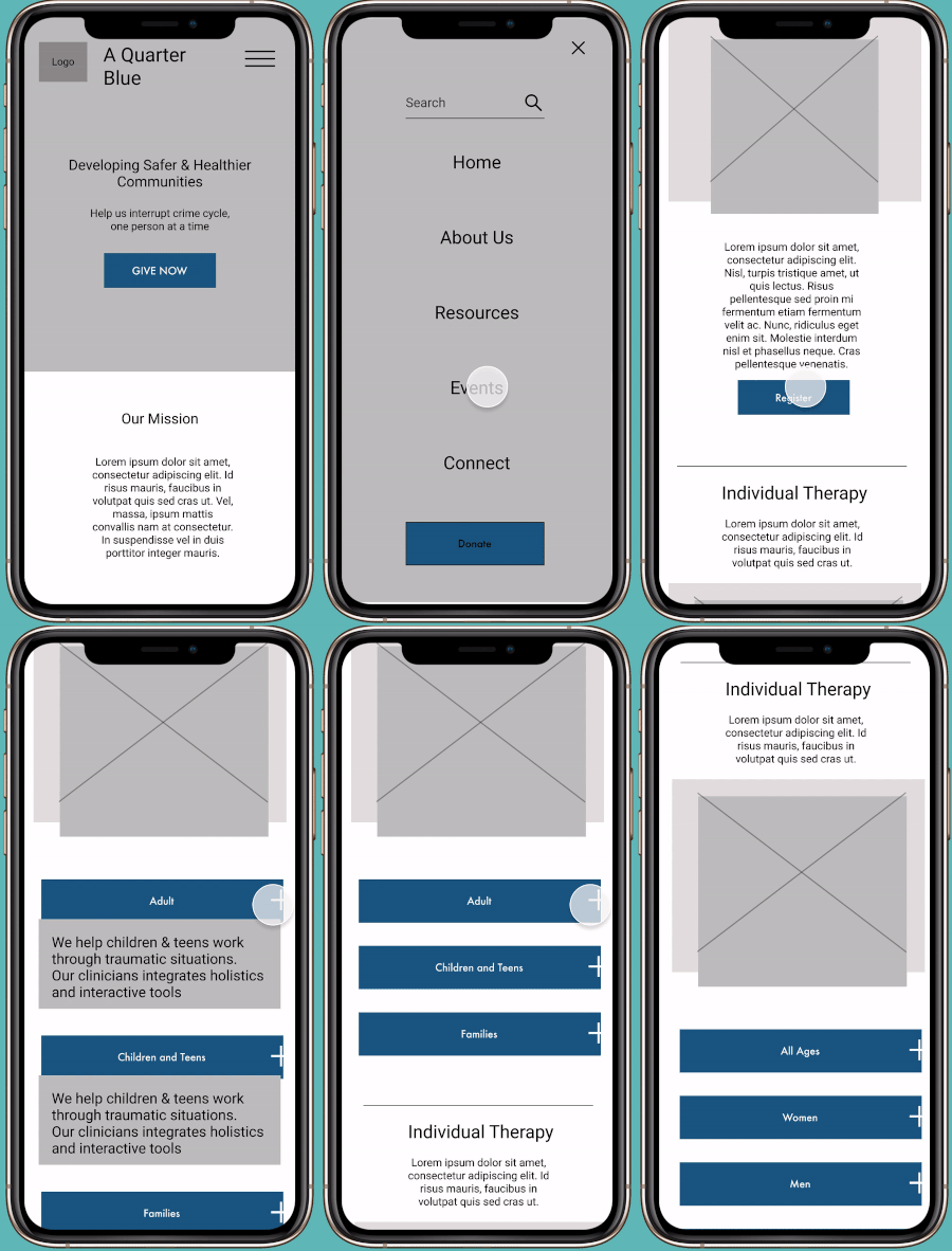
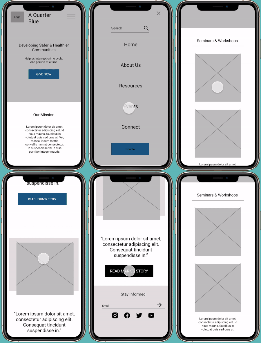
In accordance to our research, we designed our low-fidelity prototype in accordance to Jenny's predetermined user flow. We approached our design method with a mobile first approach with clear call-to-action buttons and functions for users to access home page, resources page and events page.

Jenny can read testimonies of previous clients to see how they were impacted.

Jenny can view therapy sessions available that she can partake in depending on her age group and interest

Jenny can explore A Quarter Blue website first by looking at what is available to help her.

Iterations

1. Add interactive element to resources page

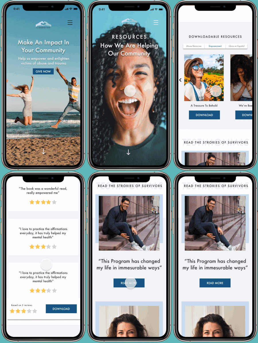
Our resource page features downloadable e-books that shows the book review and summary before download. There is also a testimonial portion where users can click to expand and read about testimonies from past clients.

After our 5 usability tests for our lo-fi wireframes, here are our findings:

Our user flow was well received, however, users wanted more interactions within each of the user flow to showcase our redesign better. The tips are as followed:

  • Add interactive element for viewing e-book resources and testimonials.
  • More emphasis on how A Quarter Blue has helped abuse victims and survivors.
  • Add breadcrumbs to the donation page.
  • Fix font sizes and button sizes for a better design look.

2. Add more graphics and statistics on how AQB has assisted the community

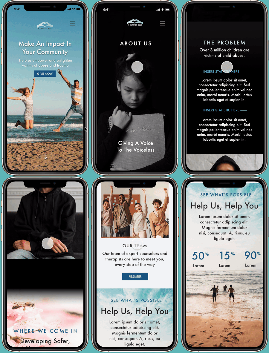
Our solution was to include large and effective banners of statistics and percentages on how we helped previous clients. Furthermore, we expanded the About Us page to include more somber colors and storytelling narrative to drive home the serious work that AQB has done for the community and for abuse survivors.

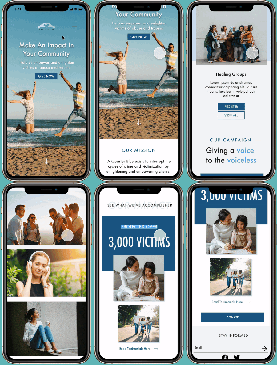
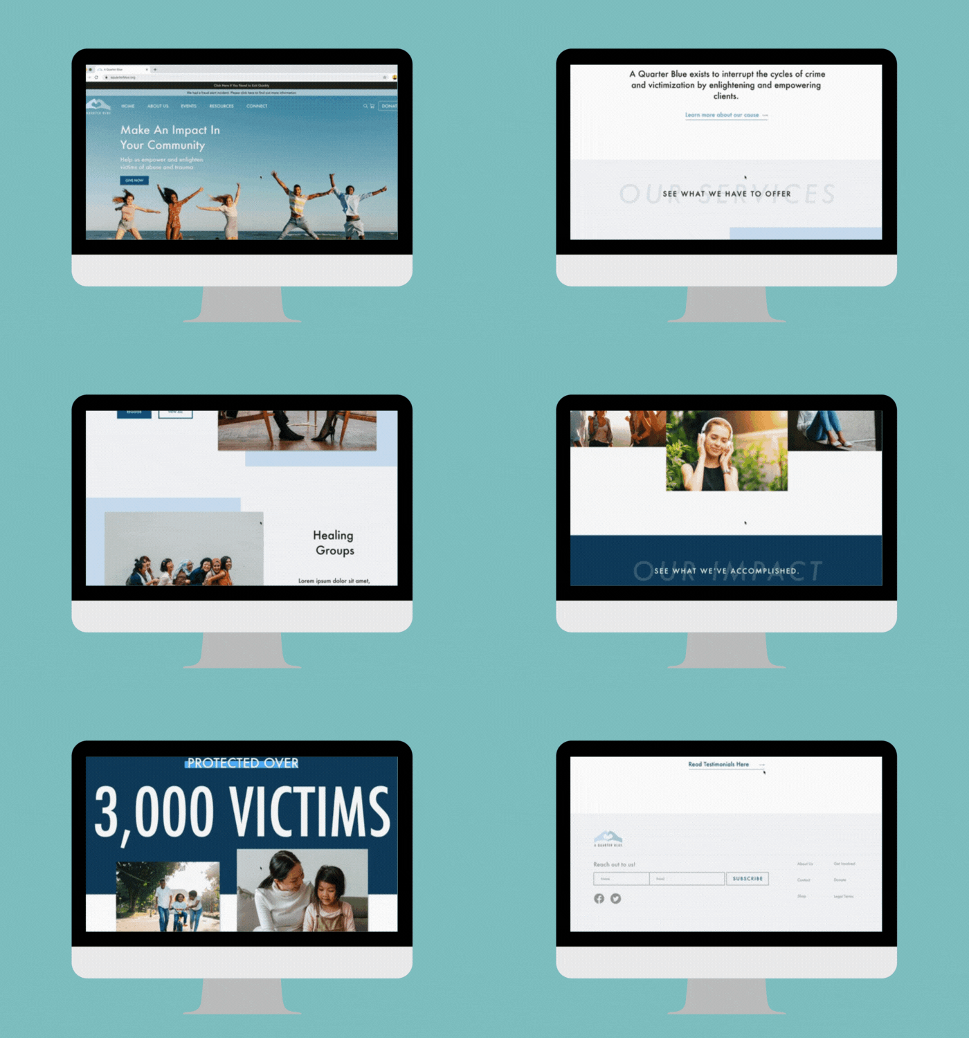
Our Final Product

Available in desktop and mobile versions

Our goal for this project was to reorganize the information architecture, improve navigation, and redesign the website into a modern, minimalistic look.

Jenny finds herself able to look for resources for herself on abusive relationships and therapy sessions. On first look, she sees every resources that is available to her on the website's homepage and its effect in the community.

Conclusion

Through our research, it was clear that visual design plays a large part in user's experience.

A modern, minimal design can positively affect user's experience when exploring the website and keep user's retention on the website.

However, seamless informational architecture and well-thought-out navigation is another incredible factor.

If it were not for the thought-out navigation and seamless user flows, users would have many pain points that would defer them from using the website to their full advantage.

In the case of Jenny, she would have been very confused and frustrated with the organization and the website.

Next steps

  • Develop the donation option and expand it from beginning until checkout
  • Create a user flow for checking out at the AQB online shop
  • Expand the registration process for registering for a therapy session.
  • Expand the testimonial sessions for previous clients to input their own testimonies onto the website