Turning six pages of raw data into a dashboard analysts could actually use
Redesigning Follow Our Cars, an internal vehicle safety litigation tool, from a developer-built prototype into a functional, scalable dashboard used by analysts and attorneys nationwide.
The data was good. Everything around it wasn't.
Follow Our Cars was built by the data team to serve their own research workflow. The interface reflected the database schema directly, with no design involvement and no consideration for usability. The result was a tool with inconsistent navigation, no filtering logic, and a learning curve steep enough that onboarding new users was effectively impossible.
Without design input, the tool had become so difficult to navigate that only 3 people in the organization knew how to use it. The redesign's goal wasn't just to improve the experience. It was to make the tool accessible to anyone who needed it.
Follow Our Cars is a lead generation tool for vehicle safety litigation
It ingests daily data from NHTSA, complaints, recalls, TSBs, and investigations, alongside S&P vehicle registration data to help a small team of analysts and attorneys identify vehicles worth pursuing as potential cases. The goal is to surface 10 qualified leads every 1.5 weeks.
The app has six pages, each serving a distinct role in the analyst workflow. Select a tab to see what each page does and what it looked like before the redesign.
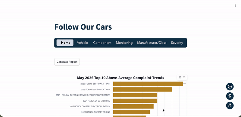
The daily starting point. Dashboards surface complaint spikes, a machine learning ranker scores the most likely leads from the past 30 days, and a Generate Report button compiles a prioritized lead list automatically.
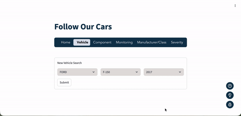
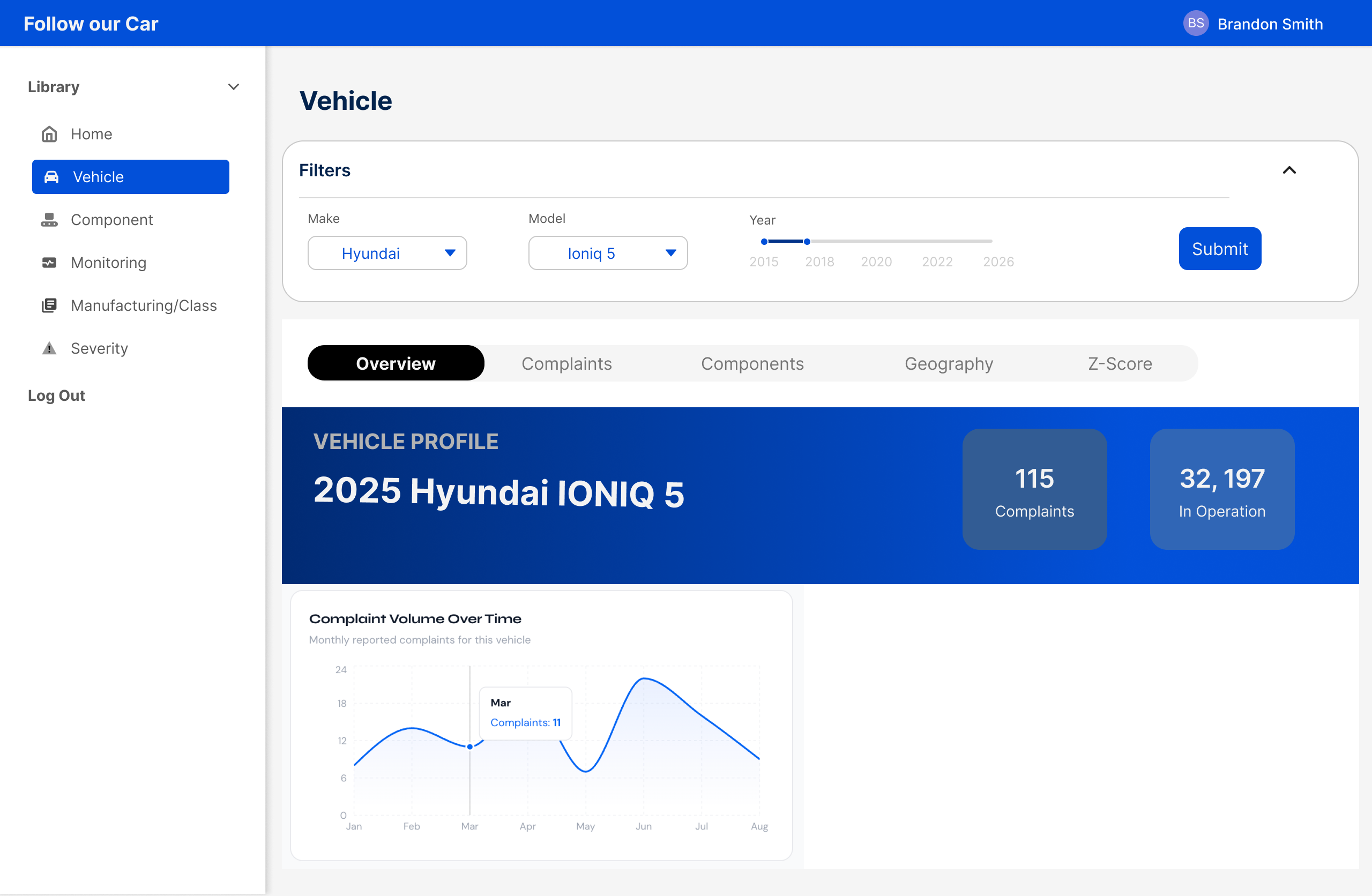
A deep-dive on a specific make, model, and year. Shows complaint and recall history, component breakdowns, geographic distribution of complaints, and a Granger Causality test that reveals whether complaint spikes in that vehicle have historically preceded recalls.
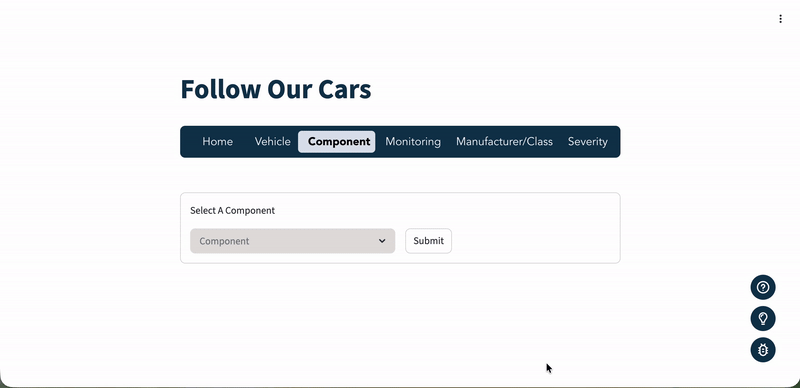
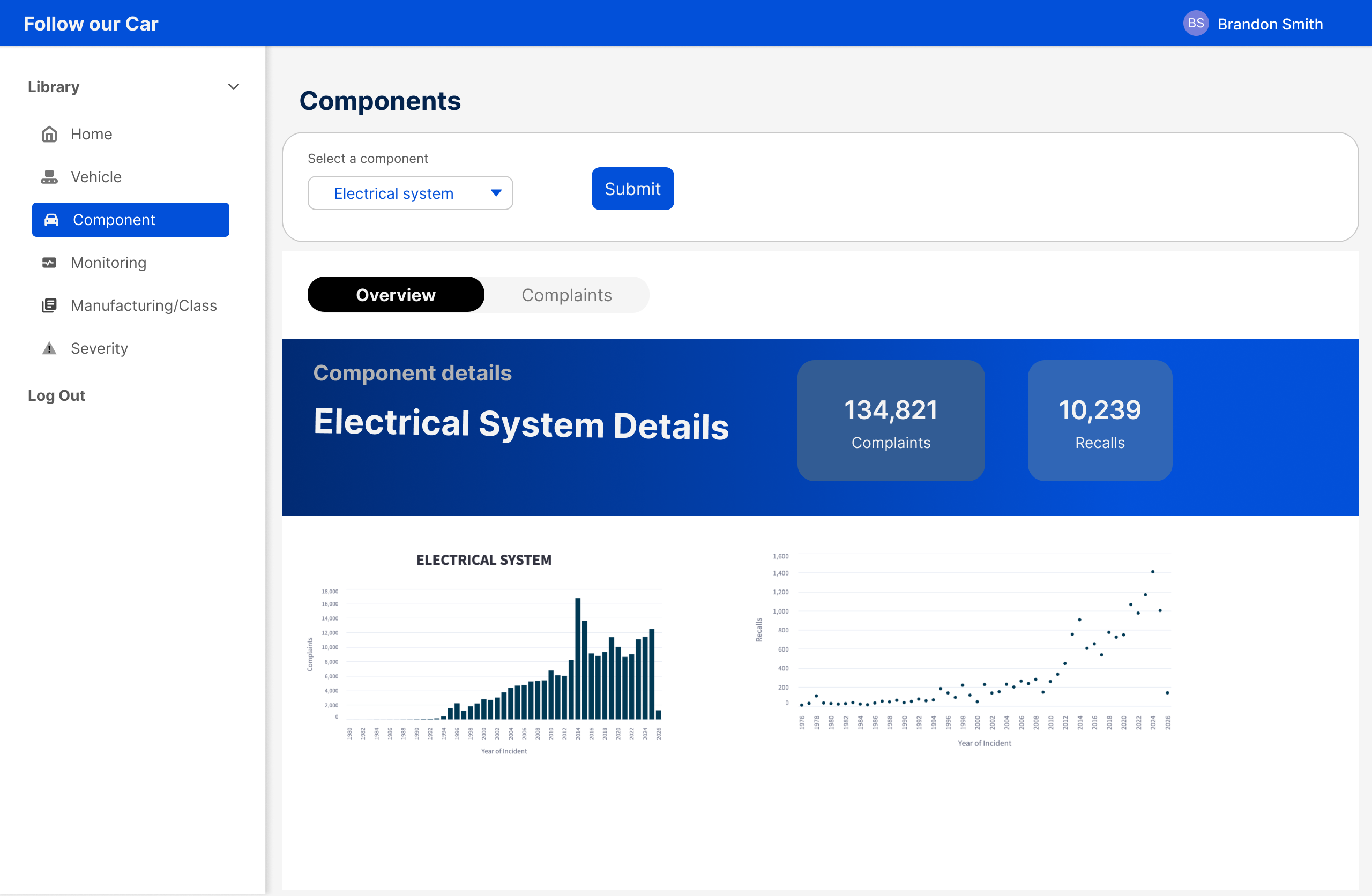
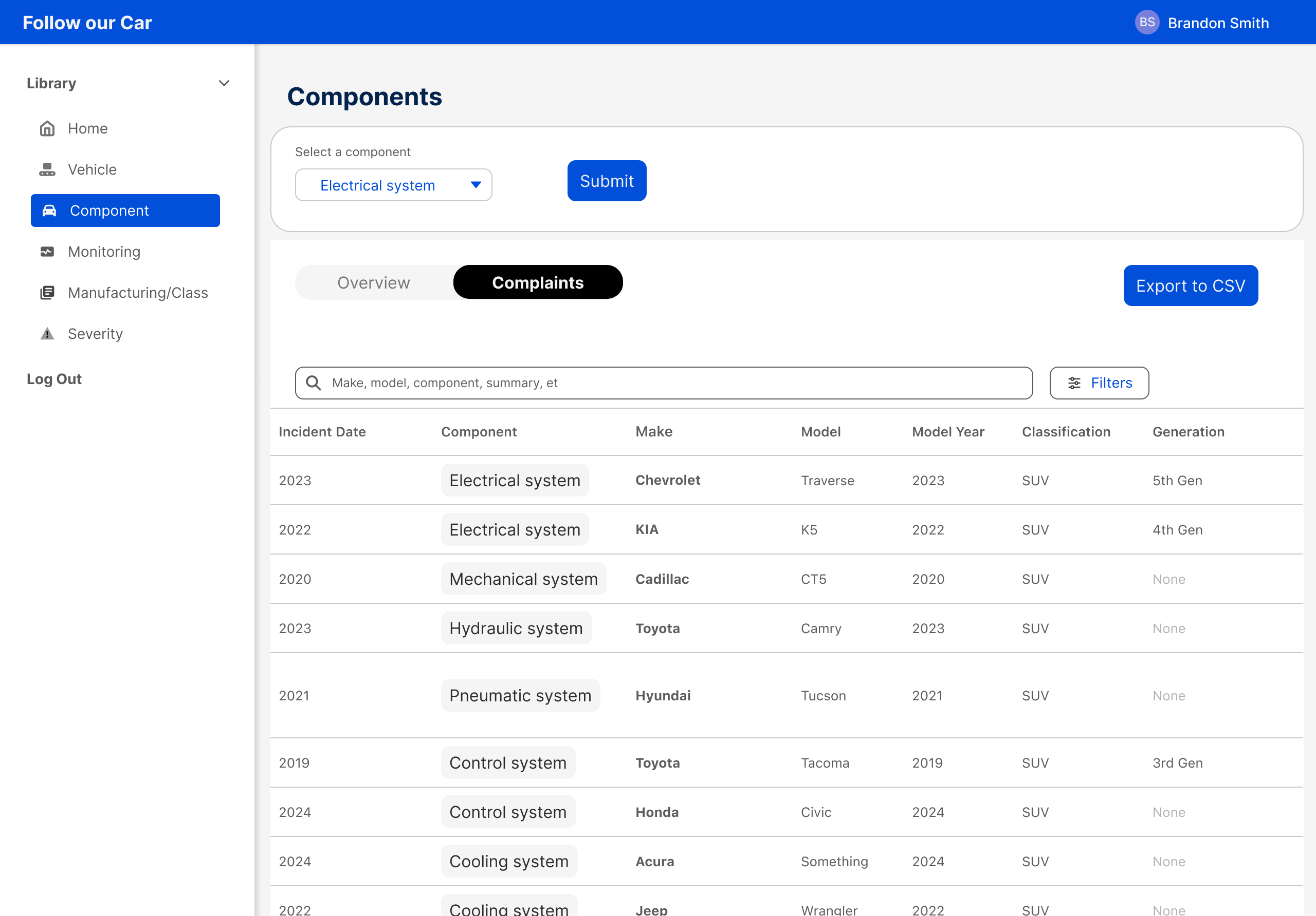
Complaint and recall trends for a single component across all vehicles and manufacturers. Used to spot cross-vehicle patterns in a specific part type.
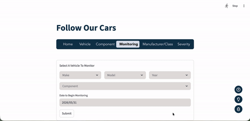
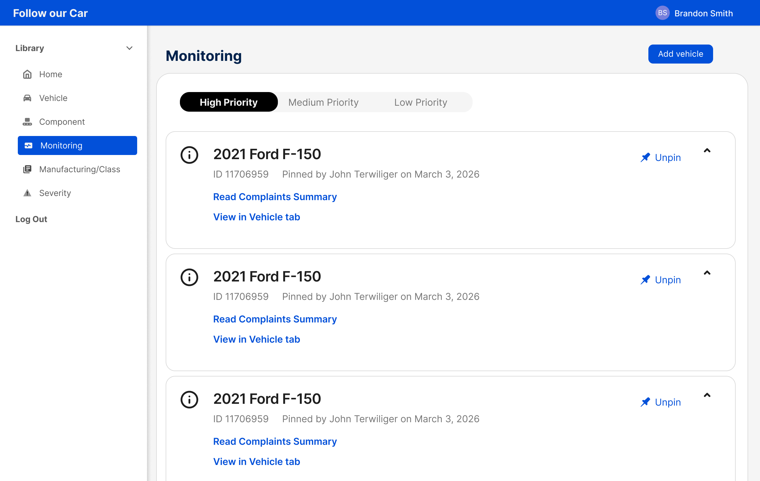
A watchlist. Analysts pin specific vehicles to track new complaints over time, with notes and timestamps for team visibility.
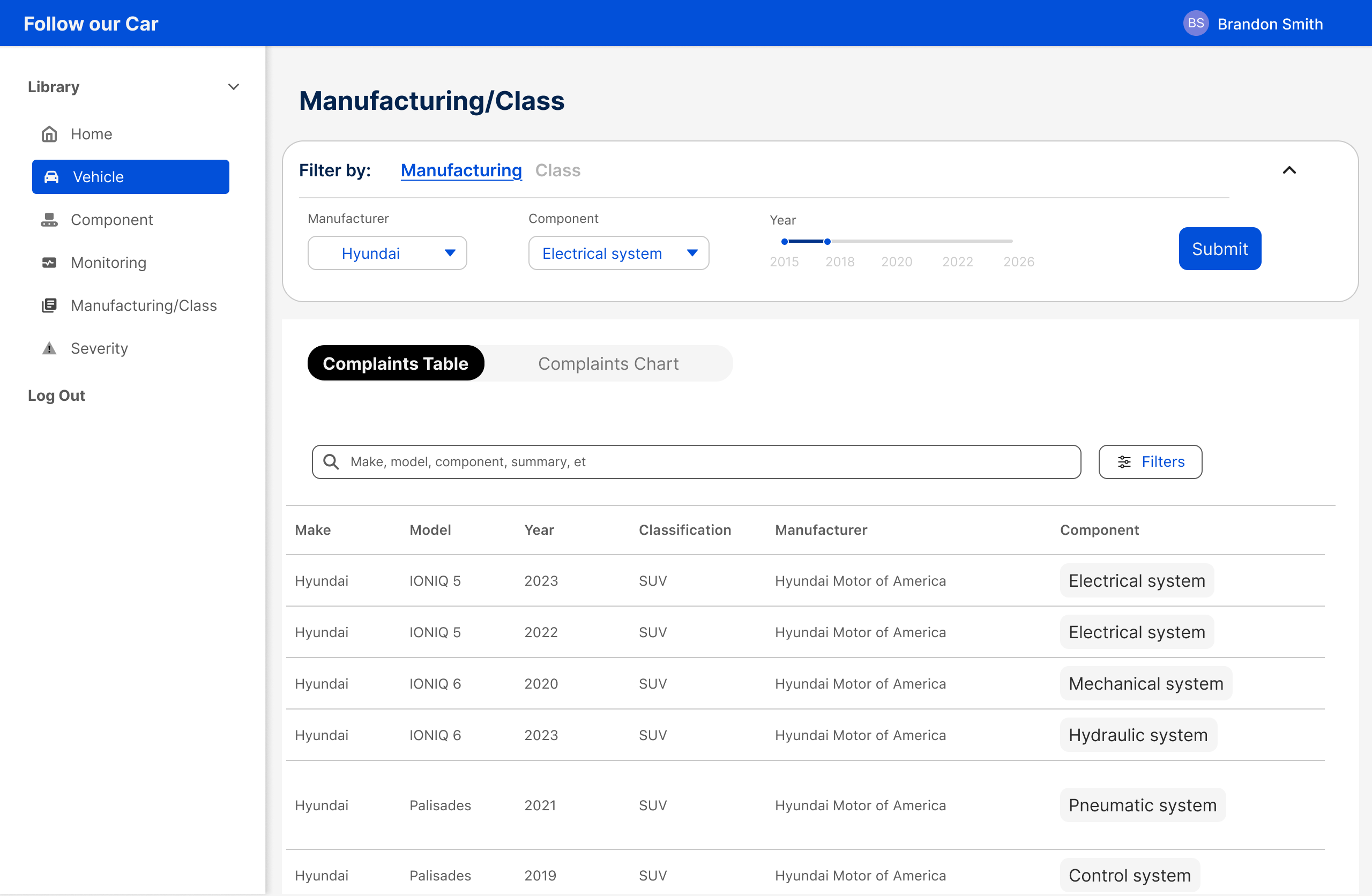
A bird's-eye view of complaints across all vehicles from one manufacturer, or across a vehicle class. Used to compare normalized complaint rates and spot patterns that span an entire product line.
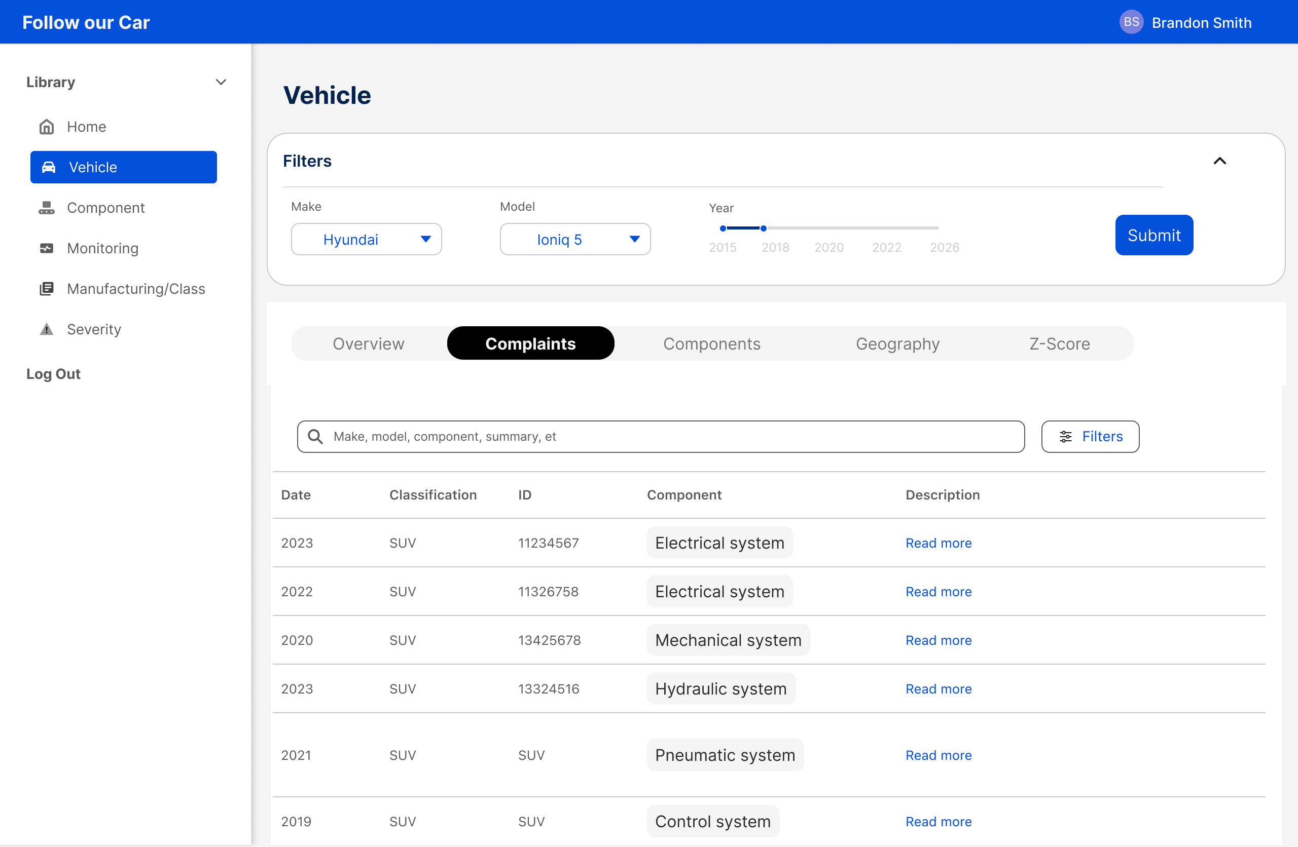
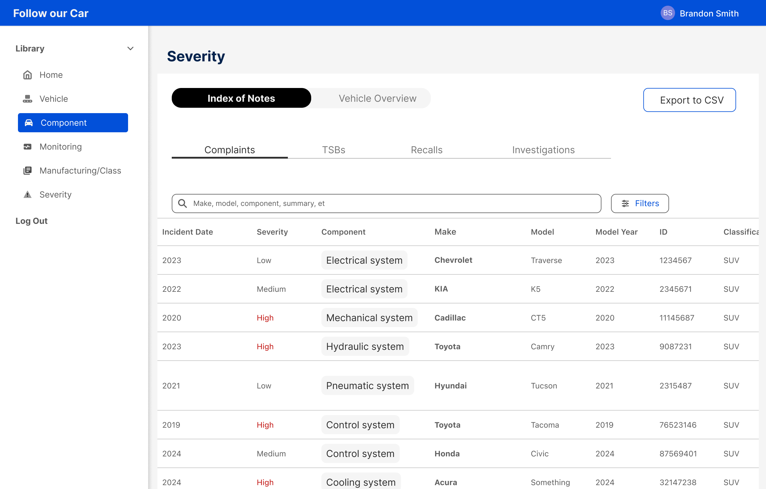
A filterable table of all complaints, TSBs, recalls, and investigations, ranked Low to Critical by an LLM. The fastest way to find the most serious items across the entire dataset.
Designed from observation, not assumption
Before touching Figma, I ran weekly calls with the analyst team to map how they actually used the tool. I documented their workflow, their pain points, and how long it took to get from raw data to a usable lead. That discovery shaped every structural decision in the redesign.
The system before the screens
Before designing any individual page, the work started at the system level. The original app had no shared components, no interaction patterns, and no navigation logic. Just six pages that happened to live under the same nav bar. Building four redesigned pages meant first establishing the foundation they would all share.
Every component, every pattern, and every page structure was designed around three criteria: simple enough to read at a glance, functional enough to get to the output without friction, and intuitive enough that someone new to the tool could orient themselves immediately.
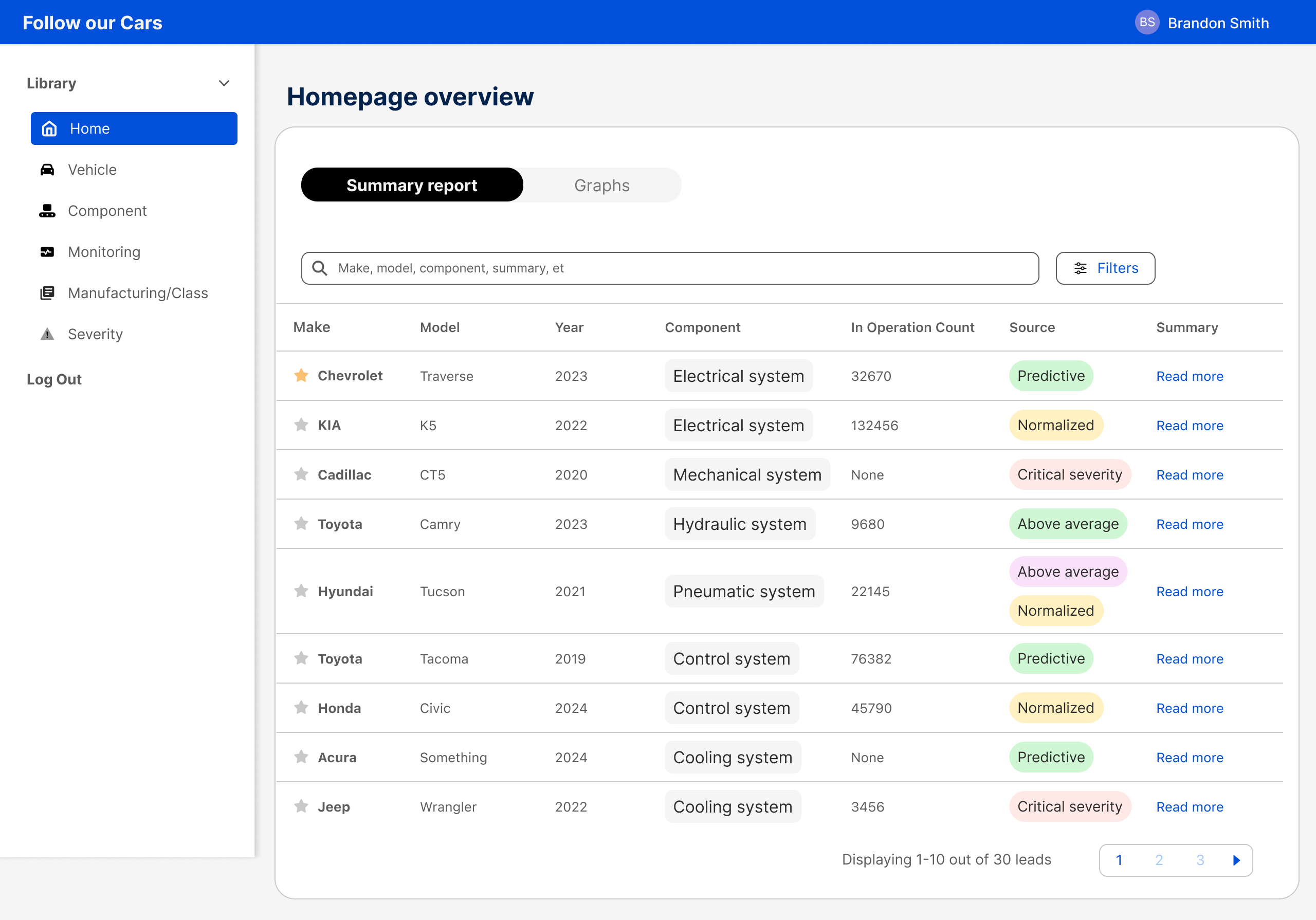
The original tab bar was handling navigation and data parsing at the same time. We separated the two: a left vertical nav for page-level navigation, a top nav bar for future functionality. Tabs were freed up for their actual job.
One rule applied across every page: data tables get their own tab, graphs get their own tab. No more endless scrolling through unrelated content to reach what you need.
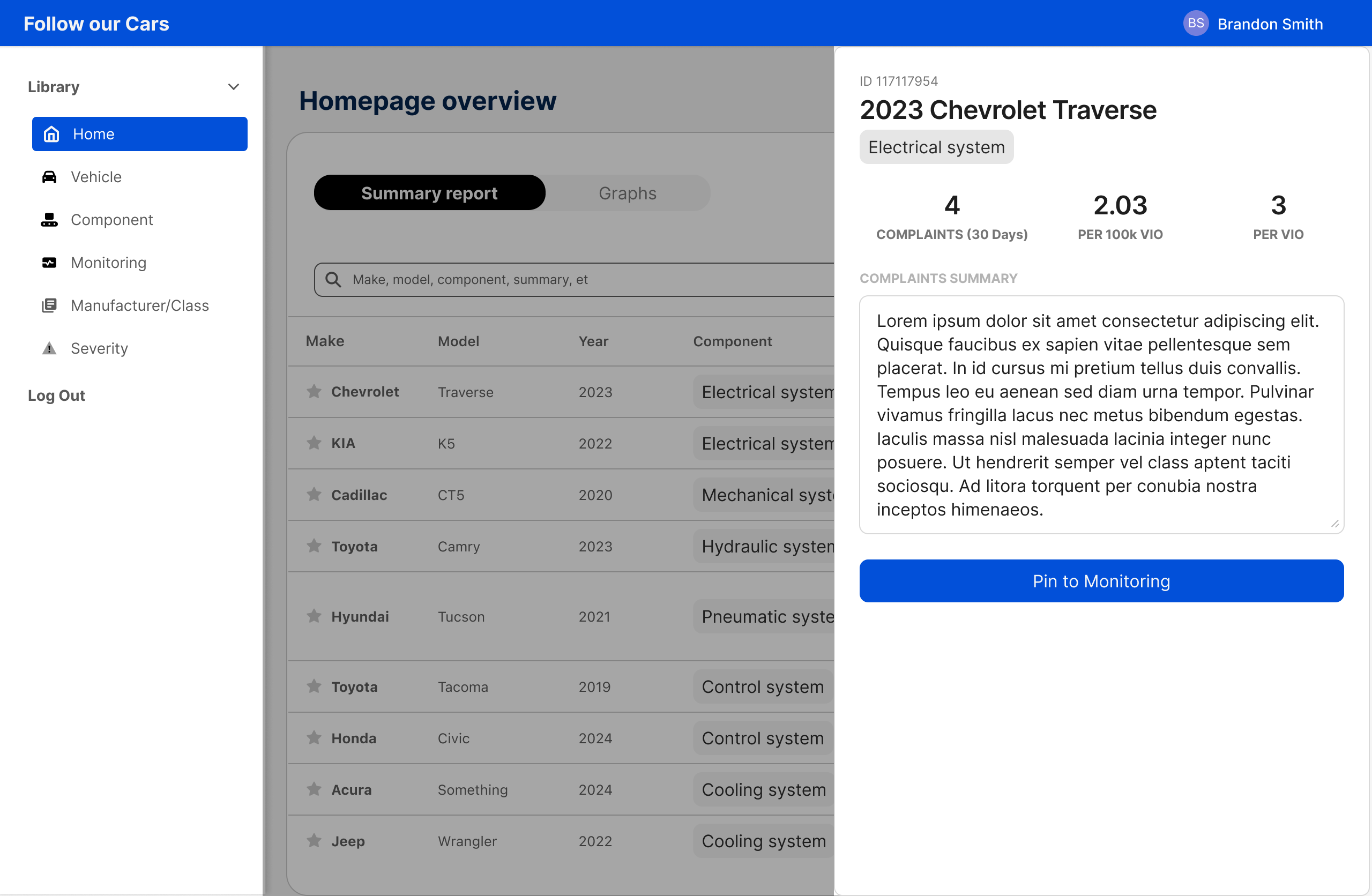
Raw complaint text was buried in dense inline tables. The side drawer replaces this for any page requiring drill-down, opening from the right without disrupting the main view and giving analysts a readable, copy-friendly layout for individual records.
Every data table shares the same filter pattern. A slide-in panel opens from the right, filters update results instantly with no submit required, active chips show what's applied, and a result count sits above every table. Empty states with a Clear All CTA handle zero-result scenarios.
Three shimmer skeleton screens cover every scenario: full page on initial load, table-only when filter changes affect only the data, graph-only when filter changes affect only the chart. Layout is preserved so analysts always know where to look when data arrives.
Each page had a structural problem that needed its own solution
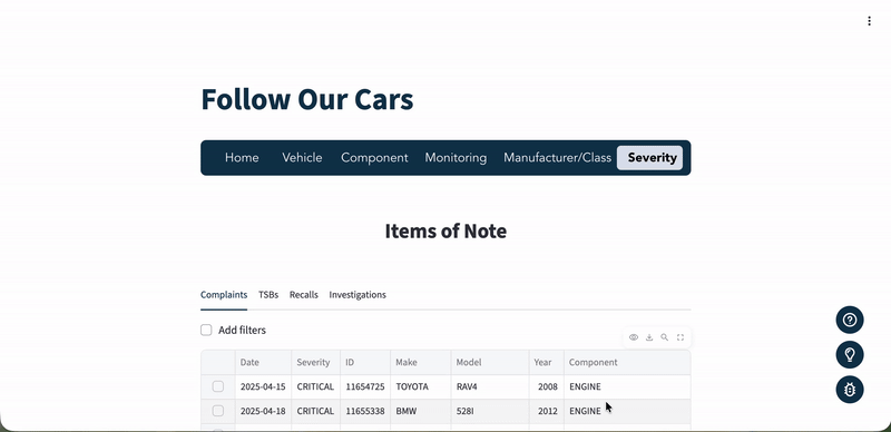
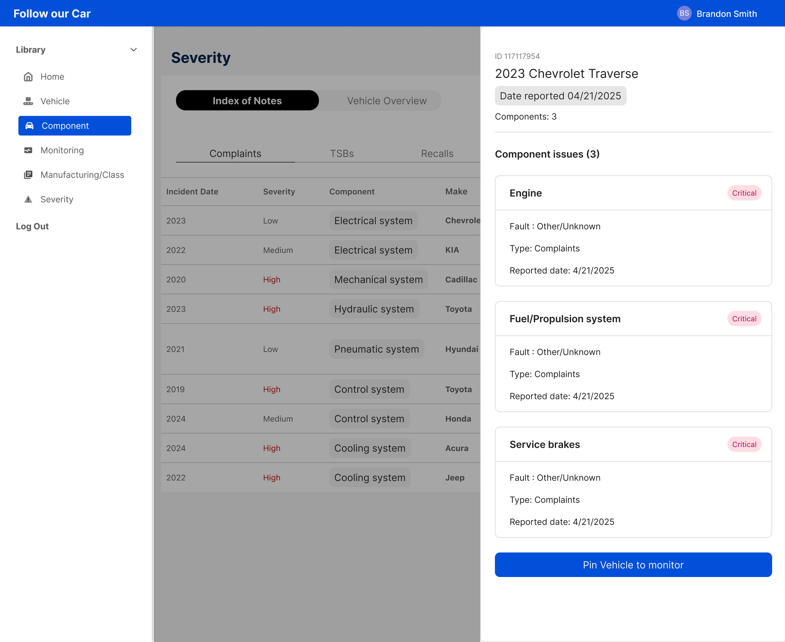
The original page organized data by document type: Complaints, TSBs, Recalls, Investigations. Since the page is named Severity, the primary organizer should reflect severity, not the database schema. Issue type became a badge on each row instead of the top-level tab. This one change made the page do what it was named to do.
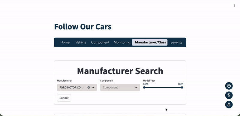
The original design showed two search forms side by side: By Manufacturer and By Vehicle Class. This created confusion about which to use and duplicated shared fields. A single pill toggle switches between modes while keeping Component and Year Range fields stable. No layout shift, no redundancy, no confusion about starting point.
Each pinned vehicle was originally a massive card that surfaced everything at once: specs, tabs, complaint text, with no visual hierarchy. The redesign leads with a risk level badge and a new-since-last-visit complaint count as the primary signal. Analysts can scan the full watchlist before deciding where to read deeply.
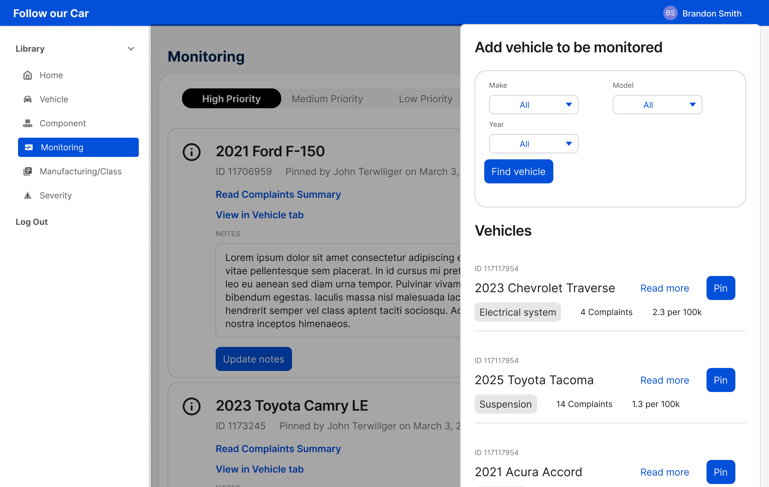
Opening a detail view in a modal would cover the table. Navigating to a new page would lose scroll position. The drawer keeps the table visible, preserves context, and puts the most important next step, pinning a vehicle to the watchlist, right where analysts need it.
From database logic to analyst logic
| Dimension | Before | After |
| Navigation | 6-item tab bar with no clear hierarchy or grouping | Left vertical nav + top nav bar with clear page separation |
| Filtering | Manual submit required to see results | Instant filtering across all pages |
| Information architecture | Data organized by document type | Severity-first IA matching analyst mental model |
| Filter feedback | Filters hidden behind an opt-in checkbox | Active chips, result counts, and empty states on every view |
| Data presentation | Endless scroll with all data on one page | Tab-separated data with tables and graphs in their own tabs |
| Drill-down | Raw complaint text in inline Excel-style tables | Right-side drawer with readable, copy-friendly layout |
| Design foundation | No tokens, no component consistency, no spacing system | Full component library with global patterns across all pages |
The redesigned experience
Six pages redesigned from the ground up. Select a tab to see the after state and what changed.
Data is separated by type — the table loads first, graphs live in their own tab. Clicking any row opens a side drawer for complaint drill-down without losing your place in the table.
A complete complaint and recall history for any specific make, model, and year. Data is separated by type across tabs, with Granger Causality surfaced as a dedicated view for analysts assessing whether complaint spikes are likely to precede a recall.
Complaint and recall trends for any component, across all vehicles and manufacturers, in one view. Analysts can spot cross-vehicle patterns and sort by recent complaint volume to identify emerging issues fast.
Pinned vehicles surface new complaints at a glance, with risk level and complaint count as the lead signal. Adding a new lead to the watchlist is a single action from any data table in the app.
Two separate search forms collapsed into one. A mode toggle switches between Manufacturer and Vehicle Class search while shared fields stay stable, eliminating redundancy and giving analysts a clear starting point.
Severity is now the primary organizer, not document type. Complaints, TSBs, recalls, and investigations are unified in one view, ranked by risk level so analysts can find critical items without switching between tabs.
The tool went from three users to six, with minimal coaching
After handoff, three new users were onboarded to the redesigned dashboard with no formal training. Analysts reported the experience was significantly clearer to navigate, and new users were able to orient themselves independently. The tribal knowledge barrier that had kept the tool locked to three people was effectively removed.
The redesign also had a measurable impact on daily workflow. The lead researcher cut 30 minutes from their daily research time, time previously spent navigating a tool that wasn't built for how they worked. Following the redesign, the research lead team's KPIs have been updated to bring 5 more leads than usual in their proposals to attorneys, a target made possible by the efficiency gains from the new dashboard.
The next phase focuses on attorney onboarding. A system of inline banners and contextual side drawers will guide new users through each feature directly within the dashboard, removing the need for external documentation or coaching entirely.